
Project Snapshot
Timeline: 2024–Present (ongoing)
Role: UX lead for component behavior + specs; governance + documentation; rollout enablement
Partners: AEM dev team, design team, content authors, stakeholders, external agency teams
Deliverables: Component requirements and variants, responsive behavior rules, accessibility considerations, AEM and Figma templates, character counts, copy/paste layout starters, enablement presentation
The Problem
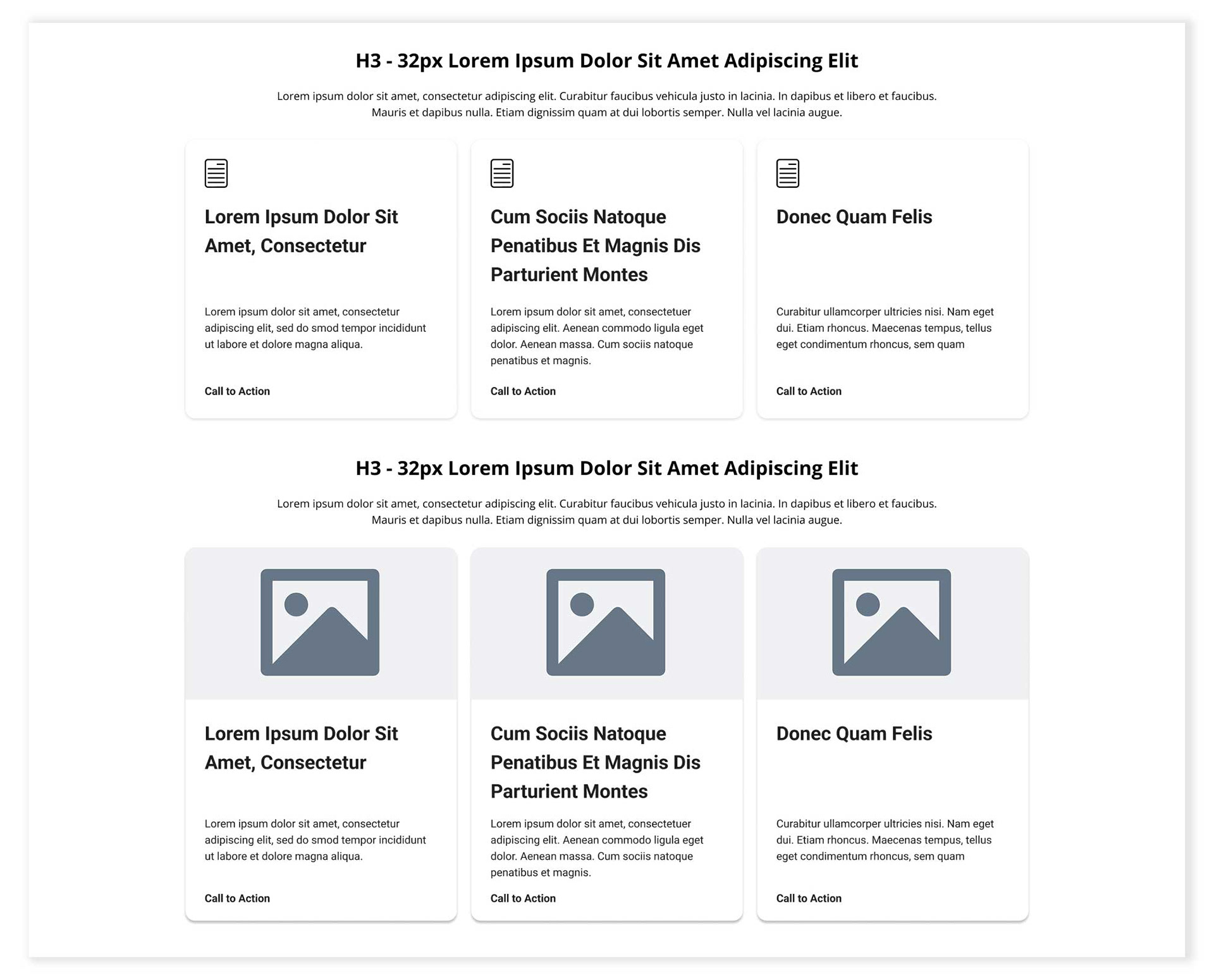
Our existing AEM card component didn’t support equal-height cards in a grid, which caused:
• Inconsistent layouts across pages
• Manual “spacer” workarounds that broke at different breakpoints
• Extra rework during QA and authoring
• Inconsistent layouts across pages
• Manual “spacer” workarounds that broke at different breakpoints
• Extra rework during QA and authoring
The goal was a reusable, responsive card system that stays consistent across the site, without brittle spacing hacks.
My Role
I owned the UX definition and governance end-to-end:
• Clarified use cases and content needs across teams (design + content + stakeholders)
• Defined component structure, variants, and responsive rules
• Partnered with AEM devs to translate UX intent into build-ready requirements
• Created Figma templates + detailed guidelines (character counts, CTA rules, layout do/don’t
• Enabled adoption by presenting to design + content authors and sharing with external teams
The Solution
We created a new AEM card component designed for real-world enterprise content:
• Equal-height behavior within card grids (responsive-safe)
• Supports headlines, rich text, images, icons/logos, and CTAs
• Flexible variants to cover multiple page needs while staying consistent
• Documented rules and templates so teams can design/build faster and with fewer inconsistencies
• Equal-height behavior within card grids (responsive-safe)
• Supports headlines, rich text, images, icons/logos, and CTAs
• Flexible variants to cover multiple page needs while staying consistent
• Documented rules and templates so teams can design/build faster and with fewer inconsistencies
Key Improvements
Consistency at Scale: Repeatable card layouts across pages and teams
Responsive Reliability: Removes the need for manual spacer adjustments
Faster Design & Authoring: Templates and guidelines reduce back-and-forth
Governance-Ready: Clear rules for content length, CTAs, and variants
Responsive Reliability: Removes the need for manual spacer adjustments
Faster Design & Authoring: Templates and guidelines reduce back-and-forth
Governance-Ready: Clear rules for content length, CTAs, and variants
Impact
• Reduced layout rework caused by inconsistent card heights and breakpoint issues
• Improved consistency across pages built by internal teams and external partners
• Enabled faster production through reusable templates and clear authoring guidance
• Established a scalable component pattern that supports ongoing site growth
• Improved consistency across pages built by internal teams and external partners
• Enabled faster production through reusable templates and clear authoring guidance
• Established a scalable component pattern that supports ongoing site growth
Next Steps
• Continue refining guidelines based on real author feedback and component evolution
• Expand the framework as new modules/components become available in AEM
• Expand the framework as new modules/components become available in AEM
Cards Before:
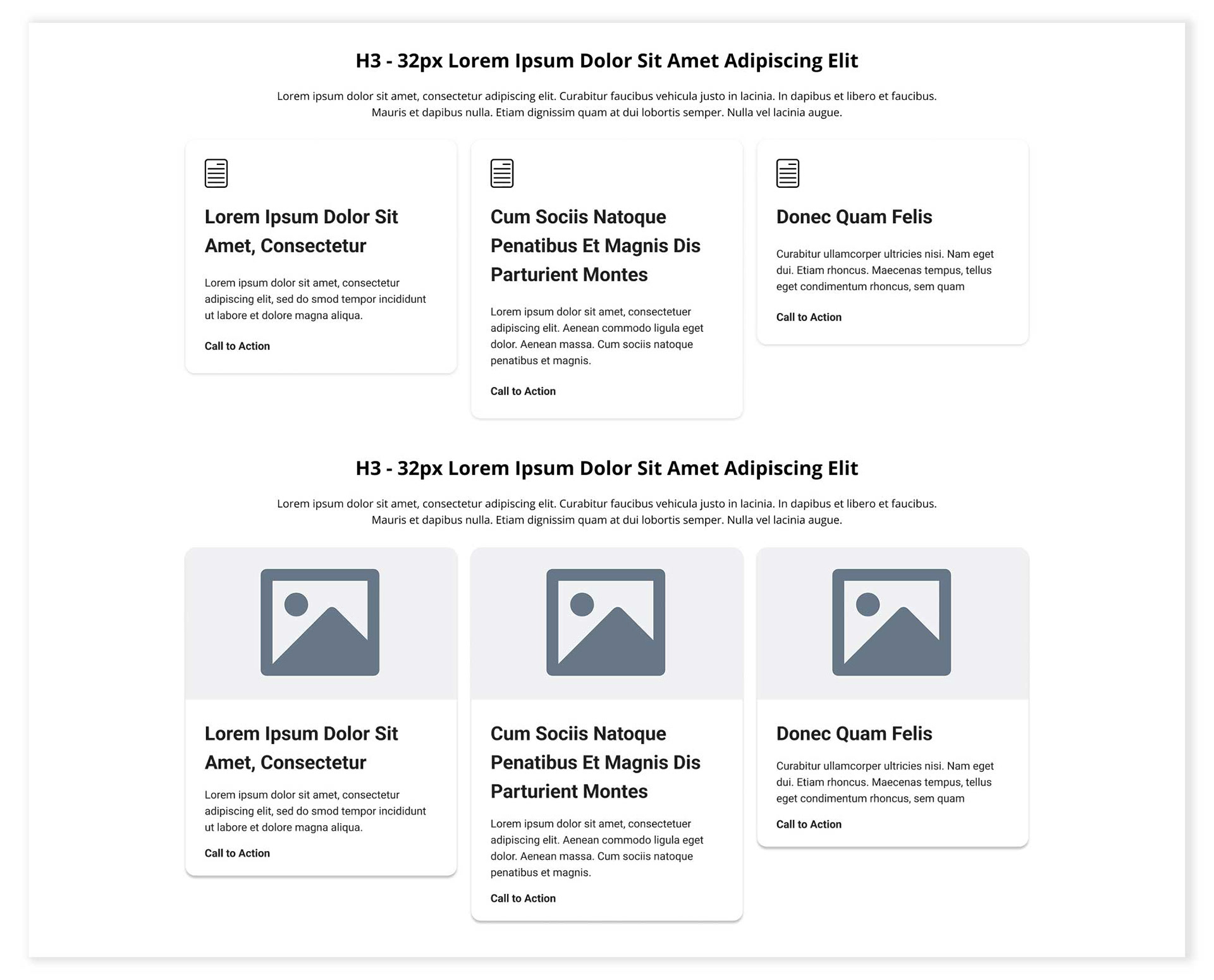
Cards After: